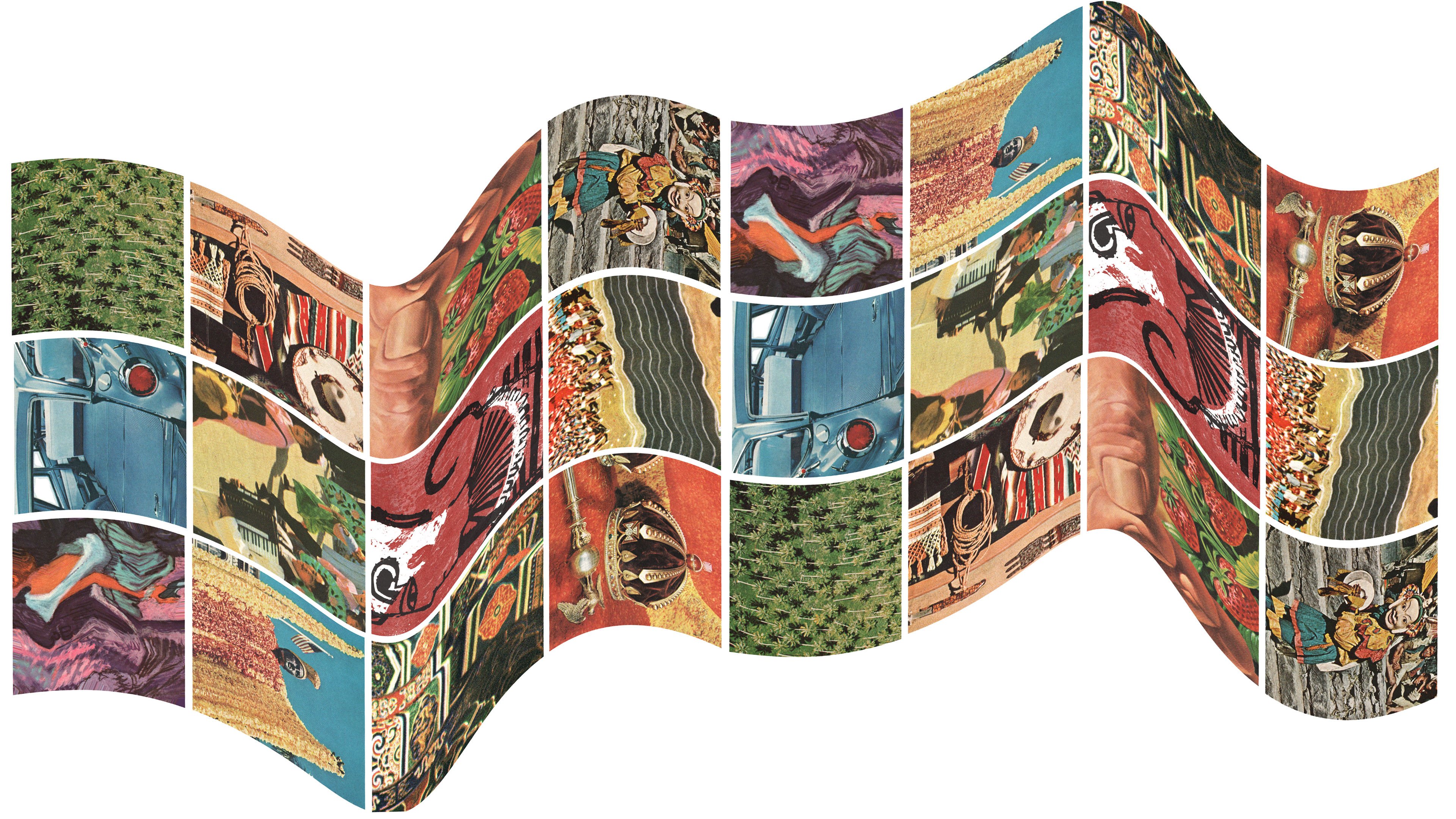
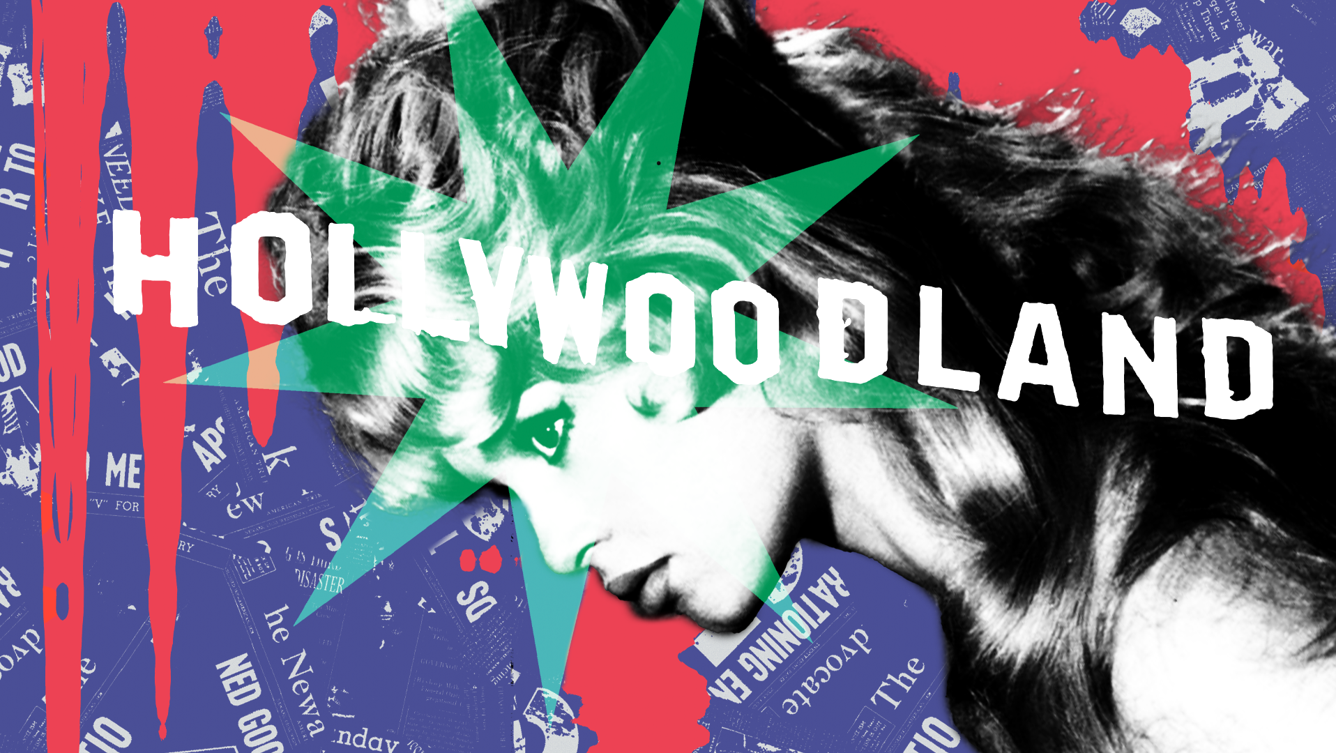
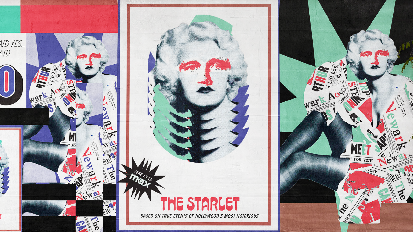
NEXT STOP: NEWARK is a branding system that positions the city as a global gateway and cultural force—inviting locals and visitors alike to rediscover its grit, motion, and creative spirit. Rooted in Newark’s role as a transit hub, the system blends the sleek optimism of Mid-century travel design with the sultry rhythms of jazz.
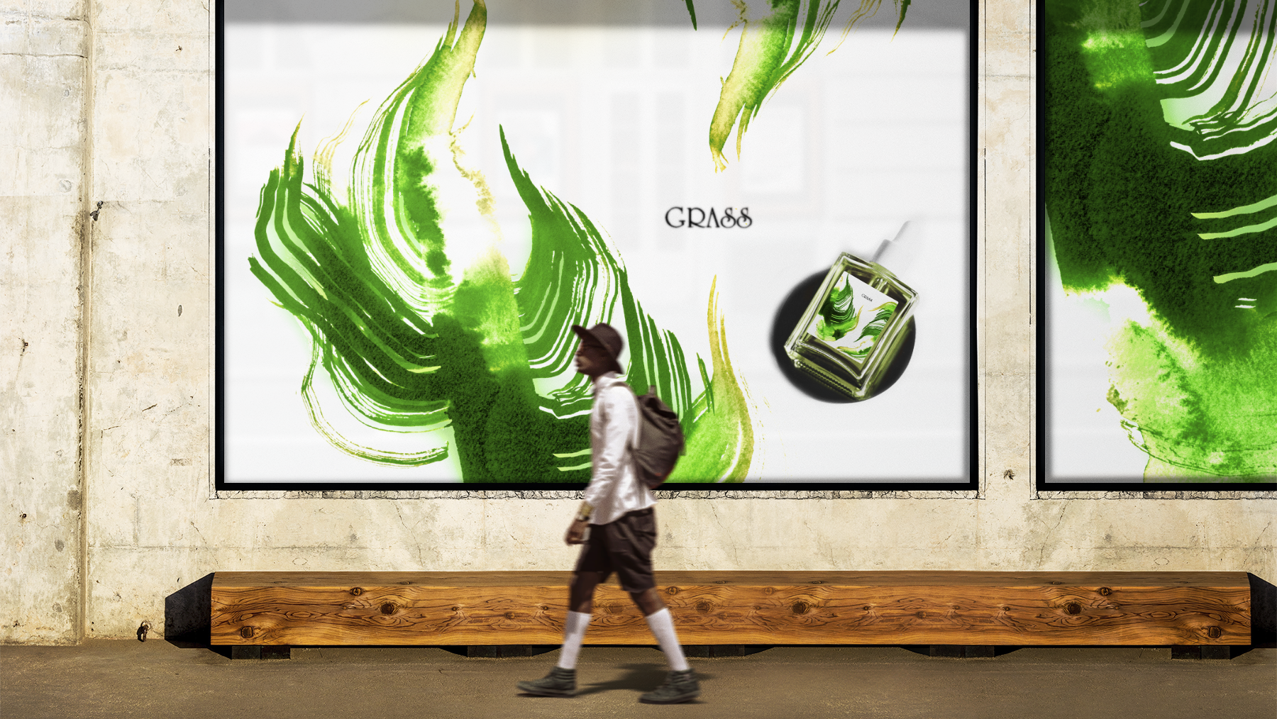
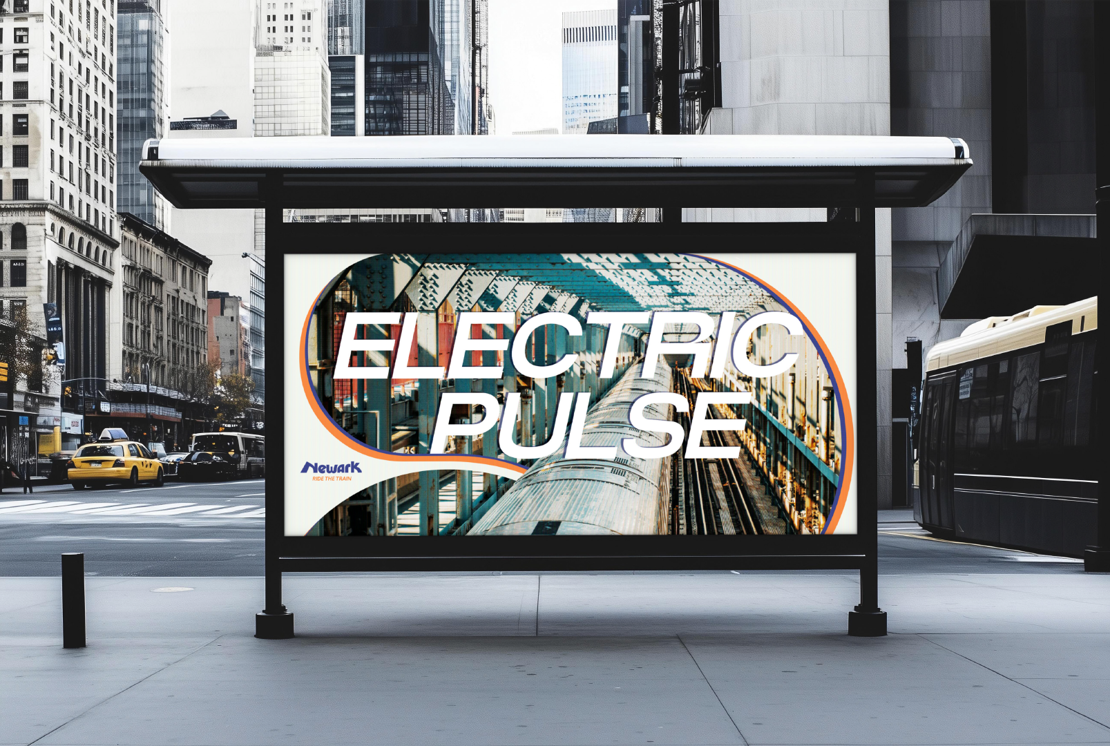
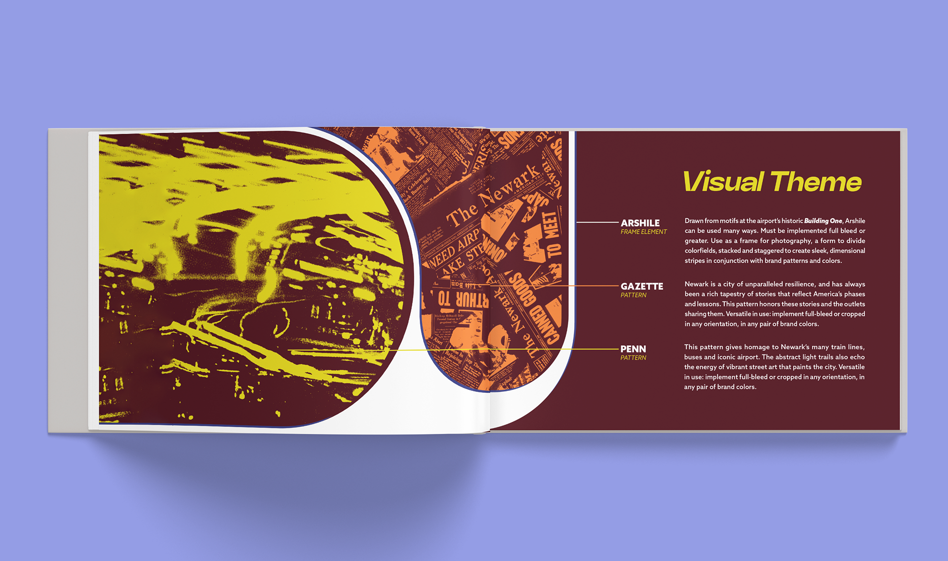
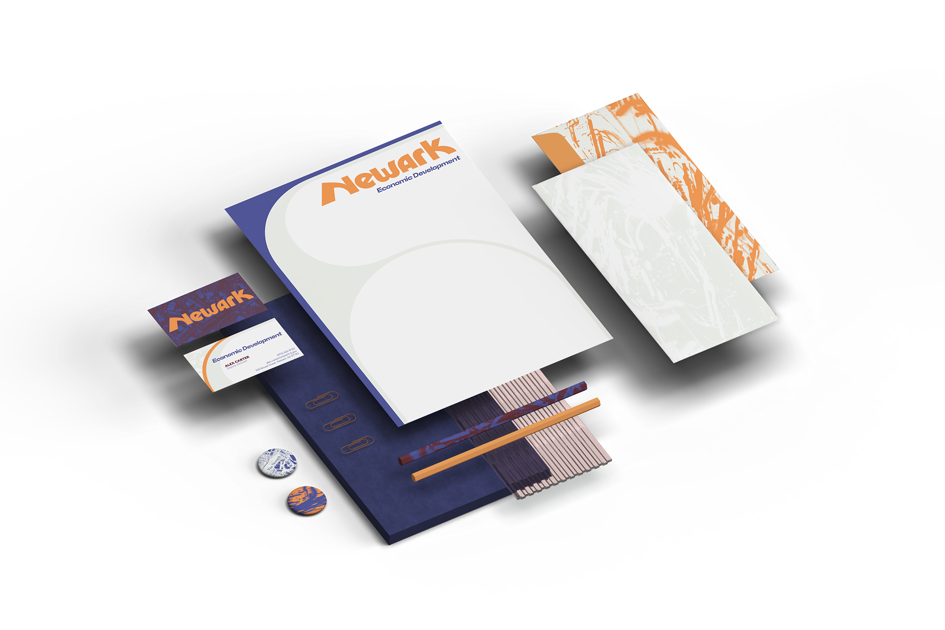
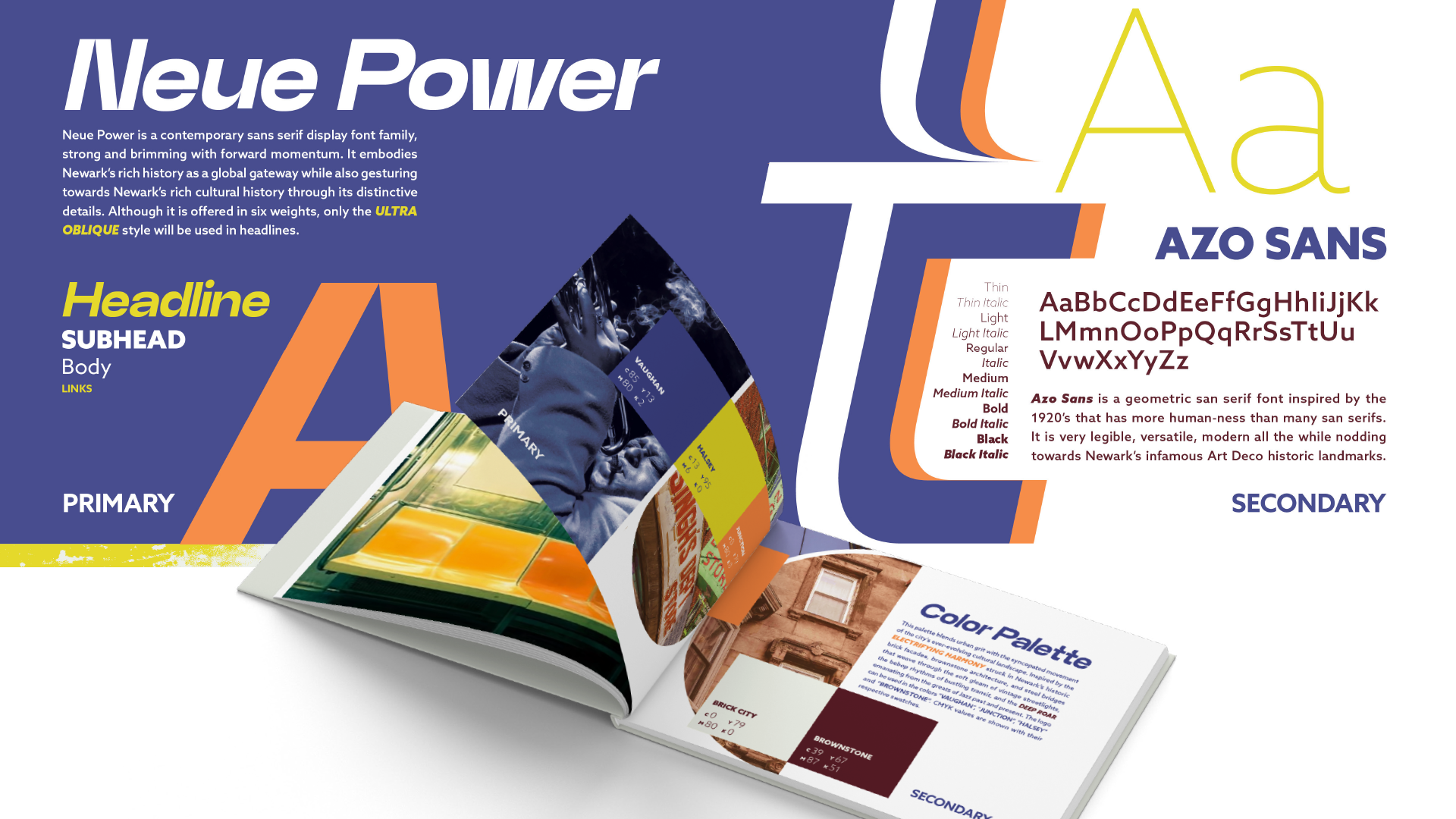
The palette drawn from city life works in tandem with versatile, bold graphic elements. Practical yet expressive, the visual language is built for real-world use—adaptable across cultural campaigns, signage, tourist materials, and digital platforms.
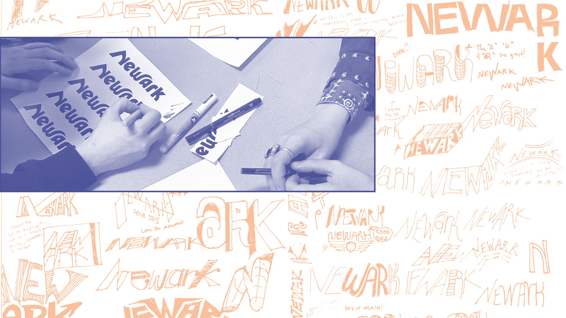
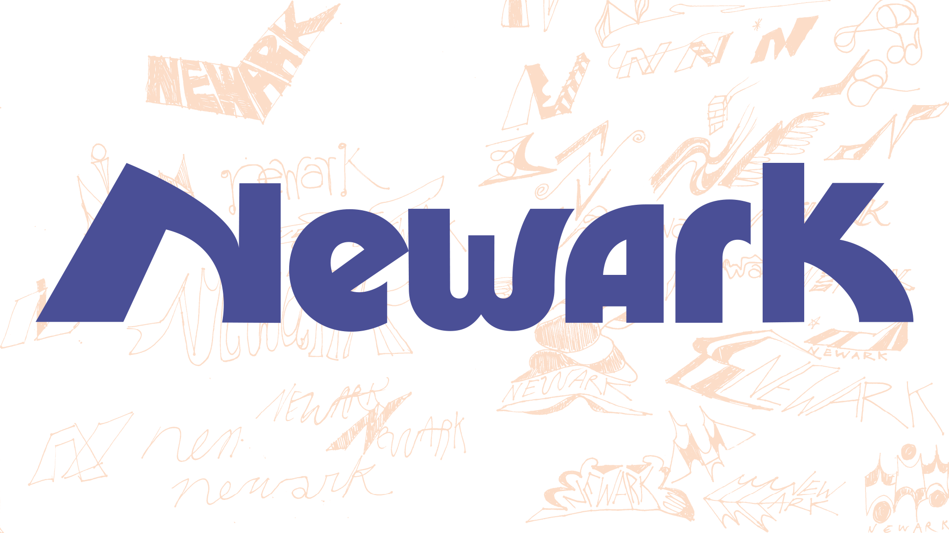
PROCESS: BEHIND THE WORDMARK
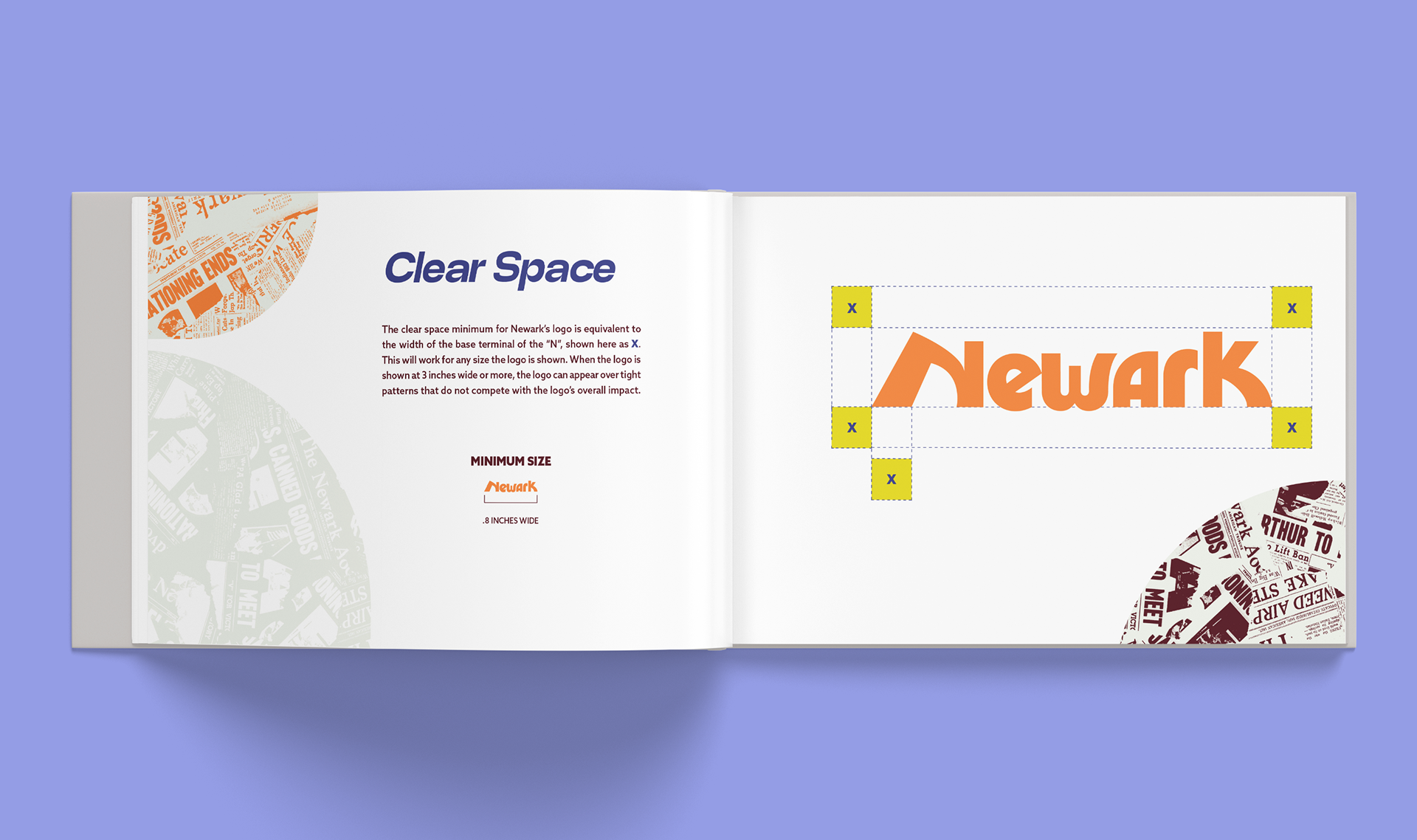
Tremendous amounts of sketching, experimentation, and research continue throughout the entire development (and discovery) of a logo and brand identity. I draw visual and structural wisdom from a wide range of references and modalities—pulling from architecture, obscure histories, music, and the broader design canon. I love to push the limits of letterforms, refining multiple solutions by hand and with software.
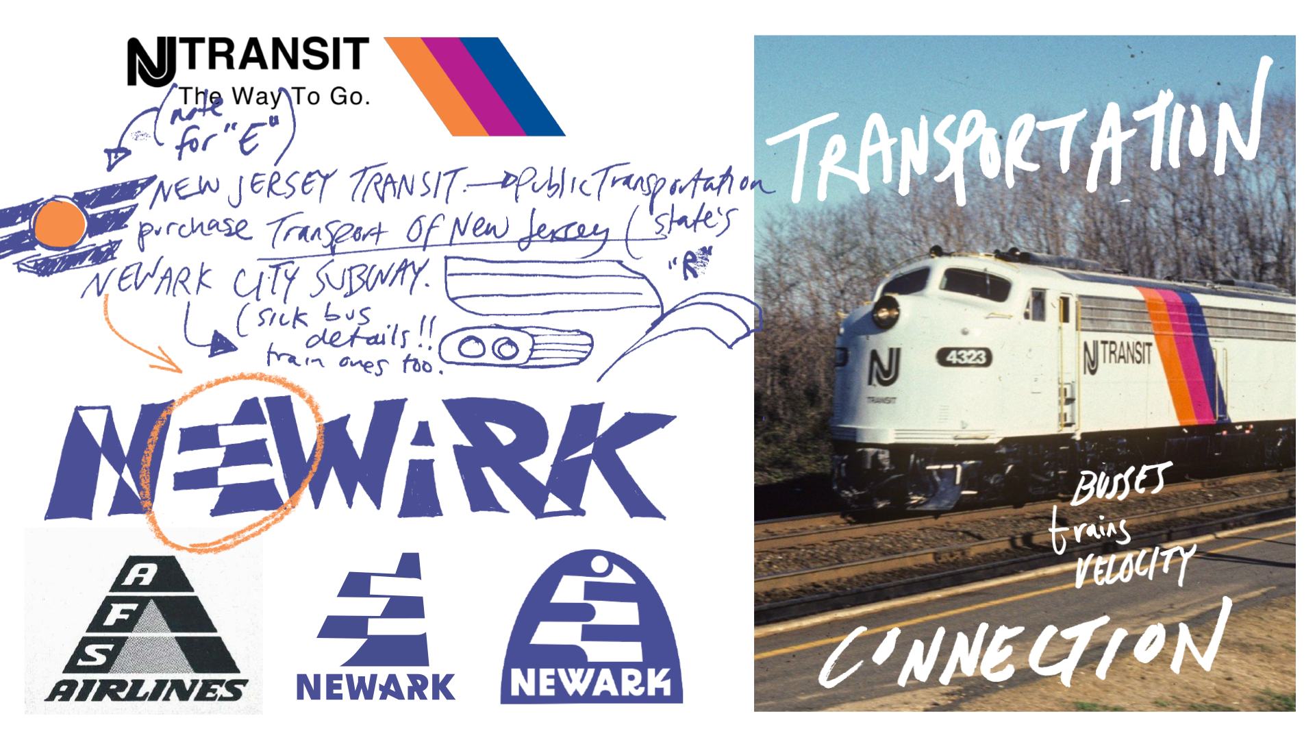
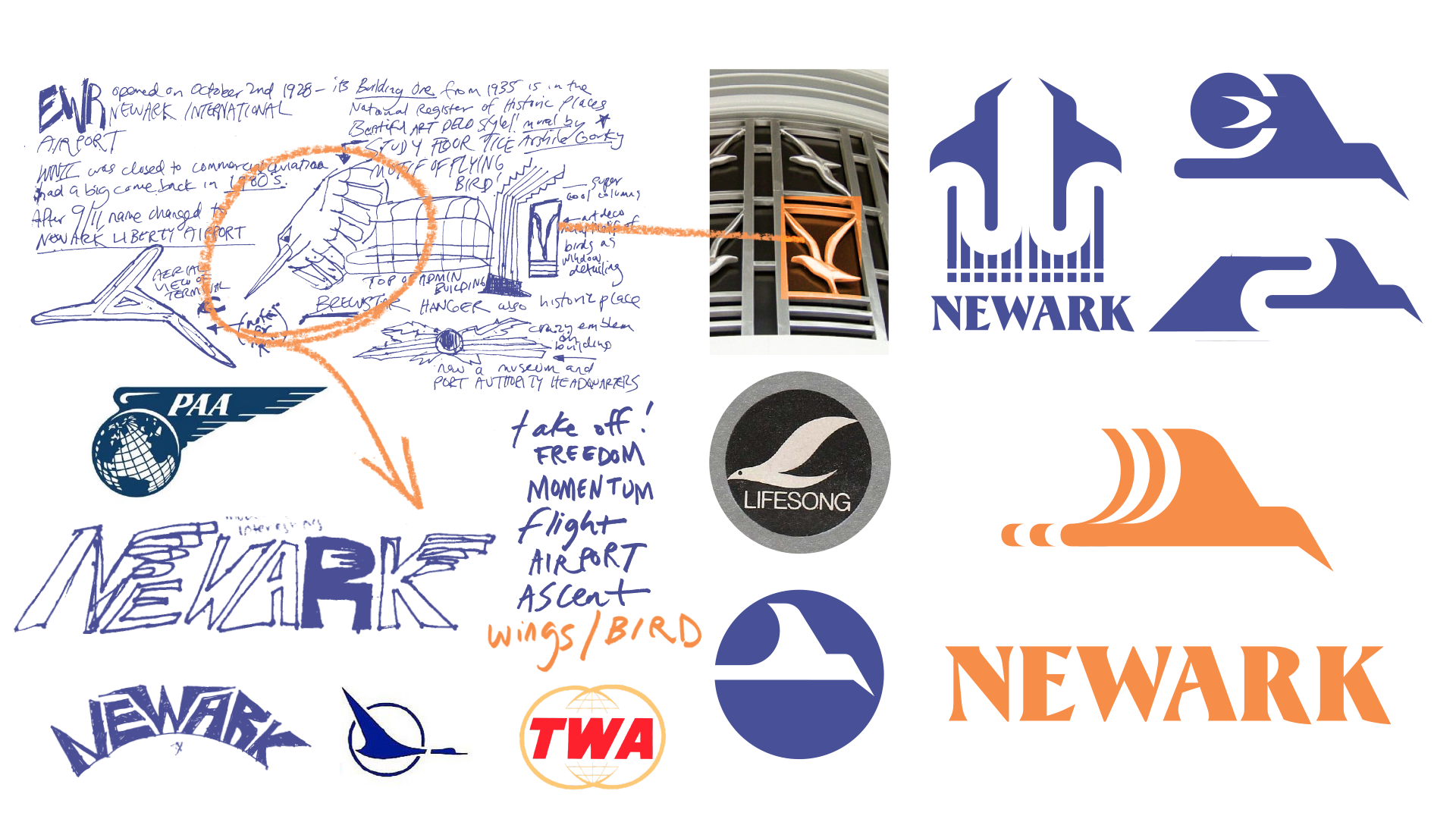
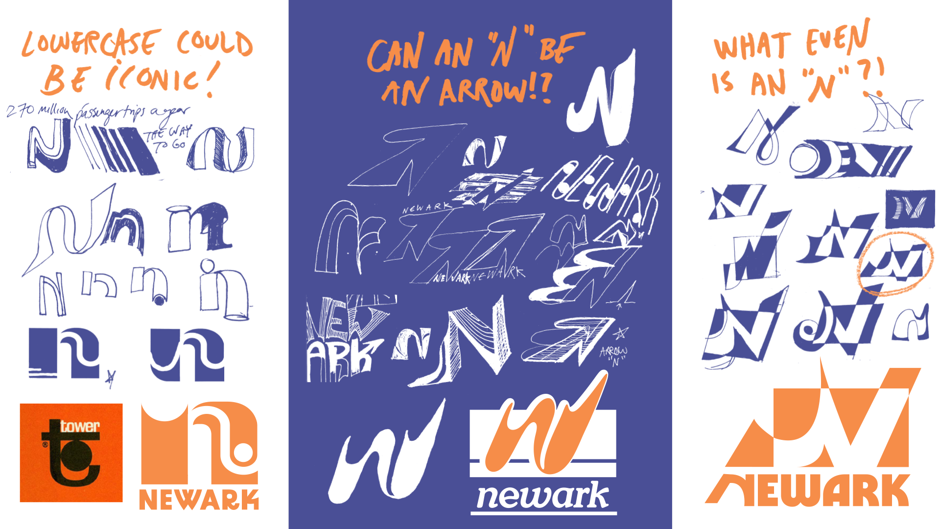
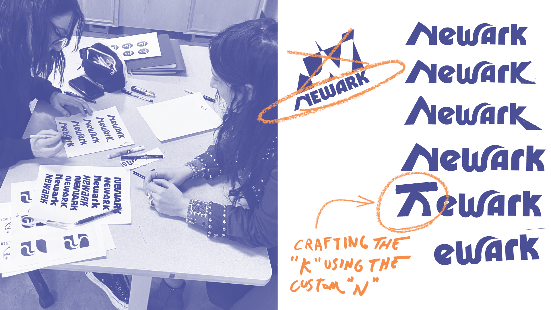
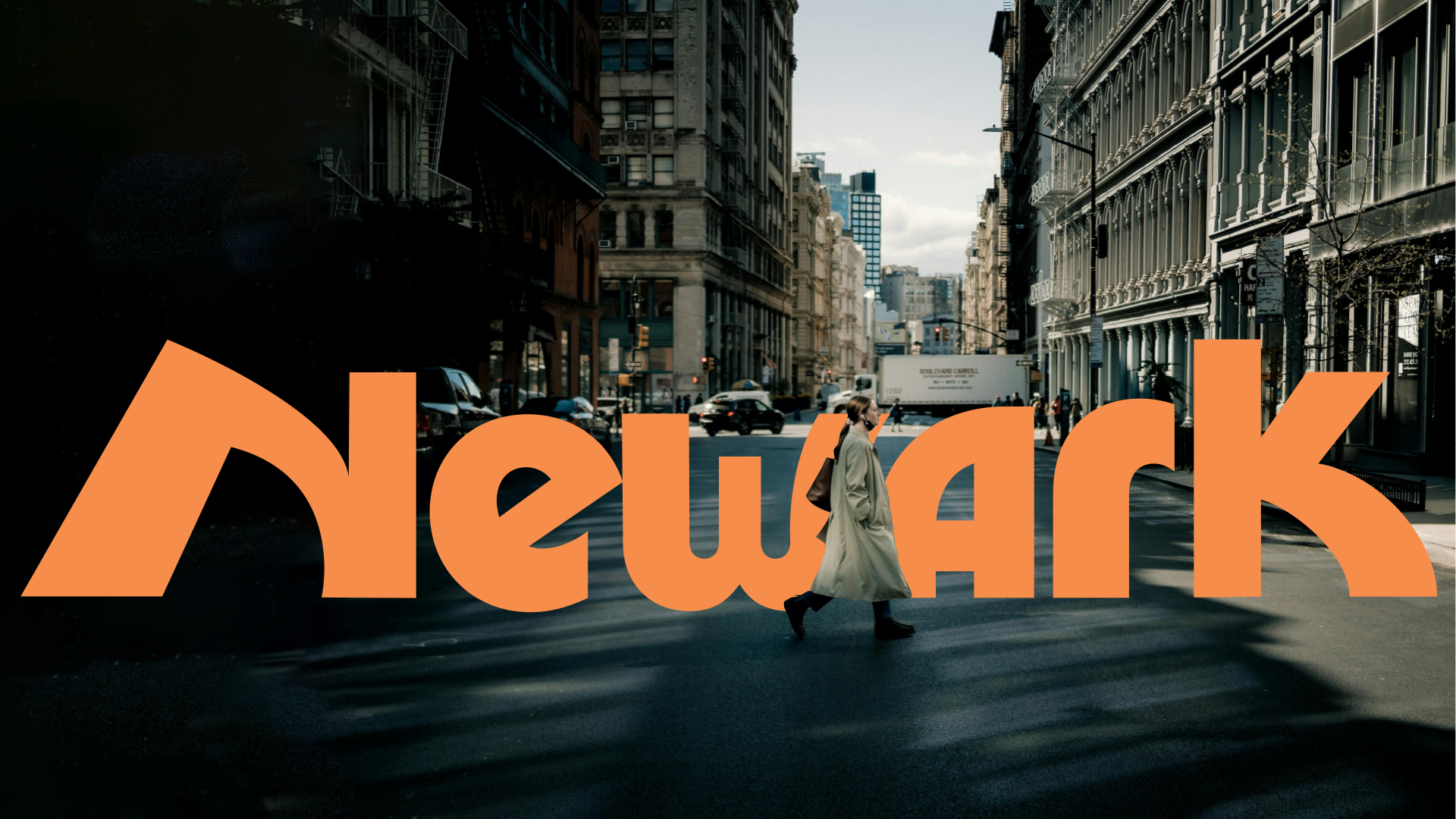
The final wordmark is bold, sculptural, and memorable. Its lines echo the sleek geometry of classic Midcentury record label and travel logos. There’s a sturdy elegance to the custom letterforms, a nod to the city’s steel bridges and the resilience of its colorful, hardworking communities. The wordmark holds its own at any scale—just as striking on a city uniform as it is on a jazz festival poster.